Inspired by the sunny day today (finally!) I decided to take the plunge and upgrade to one of the new Blogger templates - so here it is, all bright and sparkly! And not black any more. Only a few hairy moments when I tried one of the dynamic templates and lost all my buttons. Luckily, having decided that the dynamic templates were perhaps too headache-inducing and settled on a simple one instead, they all came back.
I'm not sure I like all my pale photos against this background, so I've given them borders for the moment - these may go as I'm not keen on them. But I do like the clean look.
I've just finished building (with a lot of help from Weebly) the site for Odiham Bridewell City and Guilds courses and I have to say I'm very happy with the way it looks - lots of photos of students' work against a clean white background. It's amazing what you can do with a little knowledge and determination.
The reason we've finally bitten the bullet and created a website is that we have an end-of-course exhibition coming up, so this allows us to publicise the courses and the exhibition with minimal printing costs. It is also much easier to update information on a website than printed information and we can include far more inspirational photos than we could otherwise. It's very exciting!
Note added May 2013 - Odiham Bridewell City & Guilds course archives are now part of the In Stitches website.
Sunday, 13 May 2012
Friday, 4 May 2012
. . . by the Skin of their Teeth - part 2
I promised to tell about the second quilt for the Quilters' Guild Region 3 By the Sea challenge.
 Even though I had known about the challenge for a long time (I was at the committee meeting where it was first discussed!) it was still last minute. The fabric was dyed/printed on April 16th and the final stitch went in on April 27th - some kind of record I'm sure.
The challenge was to create a quilt 10" wide by 50" long. I have been working on some fabric at Committed to Cloth on a sea theme (one of my recurring themes) which was going to be ideal for this quilt. Trouble was, none of the pieces I had was long enough, and it needed to be wholecloth (you'll see why if you look at the photos). So last time I was there I made a piece specially for this quilt. The fabric is inspired by photos of West Wittering beach, particularly the row of old groynes at the top of the beach near the river/ harbour mouth. They keep cropping up in my work - I have drawn them (see the sketch book in February) and collaged them and I'm sure they'll be around for a while longer.
The marks on the quilt are printed using thickened procion dye and an old credit card. The credit card is also used to scrape dye mixed with varying amounts of manutex over the rest of the cloth to colour it. The colours used were black (it tends to look blue when diluted), rust orange, petrol green and red-brown. The top of the fabric represents the sky, then the sea (lots of it) with the beach and the groynes in the foreground (lots of artistic license here - as anyone who knows this beach well will tell you!).
 I thought, as time was short, that I would simply machine quilt in wavy lines to represent the sea, and do something different for the beach and the sky. However, nothing is ever that simple, and after I had machine quilted lines to supplement the grasses in the middle the beach, and the FMQ'd the wood of the groynes and the puddles at their bases, the beach was crying out for texture. So I hand-couched a thread, and then another, and another.
The slippery slope!
Having started I had to continue adding hand stitching to the beach - first my favourite seeding to blend the areas round the groynes, and then I needed something quicker to fill the background. I tried a large-ish quilting stitch but as I wasn't able to get it really even I didn't like the effect, so out it came. As I started to unpick, I noticed that the smaller stitches visible on the back, spaced at about 1/4", looked really effective, so that's what ended up on the front - they give a Kantha-style effect en masse - and the ripples are just right for sand.
 Now anyone who is a quilter will know that dense quilting significantly reduces the size of the piece. So by now the bottom of the quilt was 3/4" narrower that the top! There was nothing for it but to hand quilt the top section and the sea as well!
So the sea has straight lines of running stitch in various thick threads. The sky, which is pale grey with a pale orangey-yellow, prompting the naming of the quilt Early Morning, has more seeding and the same tiny, spaced-out running stitch, this time in curved lines reminiscent of aeroplane trails. Then all I had to do was add a faced binding and a sleeve (at the Stitch Witches' meeting that evening) and it was done.
The thing I forgot to do before taking it to the Regional Day in New Milton the next day was photograph it. So these photos are dreadful - poorly lit (in a school library) and not facing straight on to the camera for the full length, which is why the rows of stitching under the groynes look curved.
We had 28 entries, all of a very high standard and so diverse. These quilts will all be displayed at the Quilt Museum and Gallery in York during July and August, so if you're near go and have a look.
And the best thing? Against all the odds, my quilt was selected as the winner of the challenge by our two speaker/ judges, Janet Twinn and Gill Turley. So sometimes last minute pays off, although I wouldn't recommend it as a way of life!
Wednesday, 2 May 2012
...by the Skin of their Teeth...
That should be my motto!
I have just completed the fourth set of work to meet its deadline by the skin of its teeth. This time it was the first four journal quilts for Contemporary Quilt's Journal Quilt project. The project runs every year, the goal being to make one small quilt every month for a year, and to post the resulting quiltlets on the group pages on Yahoo. Each year there are specific crteria, usually relating to size, and sometimes specifying a theme. This year the JQs are to be A4 portrait size, and the theme is 'Shades of . . .' with the first 4 being red, the next 4 yellow and the final 4 blue.
 You will have noticed that I said 'one small quilt every month'; not 4 small quilts on the final day of the 4th month, which of course is exactly what I did! Why do I have to be such a deadline person? I can think all round a subject for days, weeks, months even, but until the deadline is looming I cannot seem to get down to work. As it was I had planned to add my own extra theme of text to the challenge, using words in different languages to represent the colours, pigment names, wavelengths etc. I had done all the research, worked in my sketchbook, dyed and printed fabric, even made a thermofax screen . . . But I left it so late that all those plans had to be abandoned in the execution, in favour of something simple and achievable in a day.
So they are just simple explorations of colour and composition.
January's is just Red & Blue, February's is inspired by the daffodils that were in my garden in February, March's is green for spring, and April's (above) is purple - Purple Rain! (it was teeming down all day on Sunday when I made them).
And why was I so late in starting these JQs? Because I have recently completed not one, but two more quilts just in time for their deadlines too!
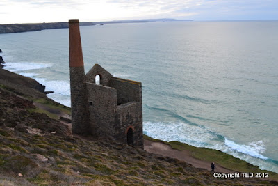
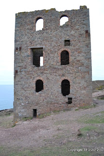
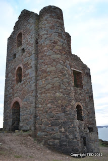
 The first was also for Contemporary Quilt, this time for their tenth birthday challenge, CQ@10. The theme was tin (10th anniversary) and the source a stunning black and white photo by Tony Howell which you can see here. I really enjoyed the research for this piece, as tin mines have been part of my psyche since we used to holiday in west Cornwall when I was a child. And we were going down to stay near Falmouth before the deadline so there was plenty of opportunity for a close look at the remains which are everywhere. Here are some pics of Wheal Coates, on the coast near St Agnes - probably the most photographed mine in Cornwall (with the exception perhaps of Botallak Crowns, which are perched precariously on the cliffs near St Just).

 The visit was just two weeks before the deadline, but I knew I could do it - I had dyed and printed fabric and worked out various designs in my sketchbook, so being able to look at the real thing rather than photos was just going to add authenticity. And the quilt was finished (albeit with no hand stitch due to time - and maybe the edges were't quite done before the photo was taken, but they are now!) and photographed, and the photo and sample submitted the day before the deadline on the 31st March.
 Here's a detail - the quilt itself is actually landscape format.
The background is simple strip-piecing using fabric that has been dyed in combinations of royal blue and petrol green. Some has been screen printed using a screen developed from a drawing of the headgear at South Crofty mine. Other marks have been made using an old credit card (my favourite technique). Another (the one that looks like vertical white and green stripes) has had the colour discharged using a thermofax screen. The stripes are actually words describing the geology of the tin-mining districts. The chimney fabric was printed with a breakdown screen to represent the stonework of the walls. The whole is densely machine quilted in straight lines using a variety of threads.
And on Friday I heard that it had been selected for the CQ exhibition at the Festival of Quilts this year! One of 23 chosen from a total of 61.
The theme of tin mines is sure to feature in future work as it has loads of potential. And I have a whole palette of suitable fabrics developed just for this.
And the second quilt was for the 'By the Sea' challenge for the Region Three regional day on Saturday. That one was made in record time, but more of that in another post.
I have just completed the fourth set of work to meet its deadline by the skin of its teeth. This time it was the first four journal quilts for Contemporary Quilt's Journal Quilt project. The project runs every year, the goal being to make one small quilt every month for a year, and to post the resulting quiltlets on the group pages on Yahoo. Each year there are specific crteria, usually relating to size, and sometimes specifying a theme. This year the JQs are to be A4 portrait size, and the theme is 'Shades of . . .' with the first 4 being red, the next 4 yellow and the final 4 blue.

So they are just simple explorations of colour and composition.
January's is just Red & Blue, February's is inspired by the daffodils that were in my garden in February, March's is green for spring, and April's (above) is purple - Purple Rain! (it was teeming down all day on Sunday when I made them).
And why was I so late in starting these JQs? Because I have recently completed not one, but two more quilts just in time for their deadlines too!
 The first was also for Contemporary Quilt, this time for their tenth birthday challenge, CQ@10. The theme was tin (10th anniversary) and the source a stunning black and white photo by Tony Howell which you can see here. I really enjoyed the research for this piece, as tin mines have been part of my psyche since we used to holiday in west Cornwall when I was a child. And we were going down to stay near Falmouth before the deadline so there was plenty of opportunity for a close look at the remains which are everywhere. Here are some pics of Wheal Coates, on the coast near St Agnes - probably the most photographed mine in Cornwall (with the exception perhaps of Botallak Crowns, which are perched precariously on the cliffs near St Just).


 The visit was just two weeks before the deadline, but I knew I could do it - I had dyed and printed fabric and worked out various designs in my sketchbook, so being able to look at the real thing rather than photos was just going to add authenticity. And the quilt was finished (albeit with no hand stitch due to time - and maybe the edges were't quite done before the photo was taken, but they are now!) and photographed, and the photo and sample submitted the day before the deadline on the 31st March.
 Here's a detail - the quilt itself is actually landscape format.
The background is simple strip-piecing using fabric that has been dyed in combinations of royal blue and petrol green. Some has been screen printed using a screen developed from a drawing of the headgear at South Crofty mine. Other marks have been made using an old credit card (my favourite technique). Another (the one that looks like vertical white and green stripes) has had the colour discharged using a thermofax screen. The stripes are actually words describing the geology of the tin-mining districts. The chimney fabric was printed with a breakdown screen to represent the stonework of the walls. The whole is densely machine quilted in straight lines using a variety of threads.
And on Friday I heard that it had been selected for the CQ exhibition at the Festival of Quilts this year! One of 23 chosen from a total of 61.
The theme of tin mines is sure to feature in future work as it has loads of potential. And I have a whole palette of suitable fabrics developed just for this.
And the second quilt was for the 'By the Sea' challenge for the Region Three regional day on Saturday. That one was made in record time, but more of that in another post.
Subscribe to:
Posts (Atom)